Read all about ‘The Newspaper Club’ website re-design.
Overview
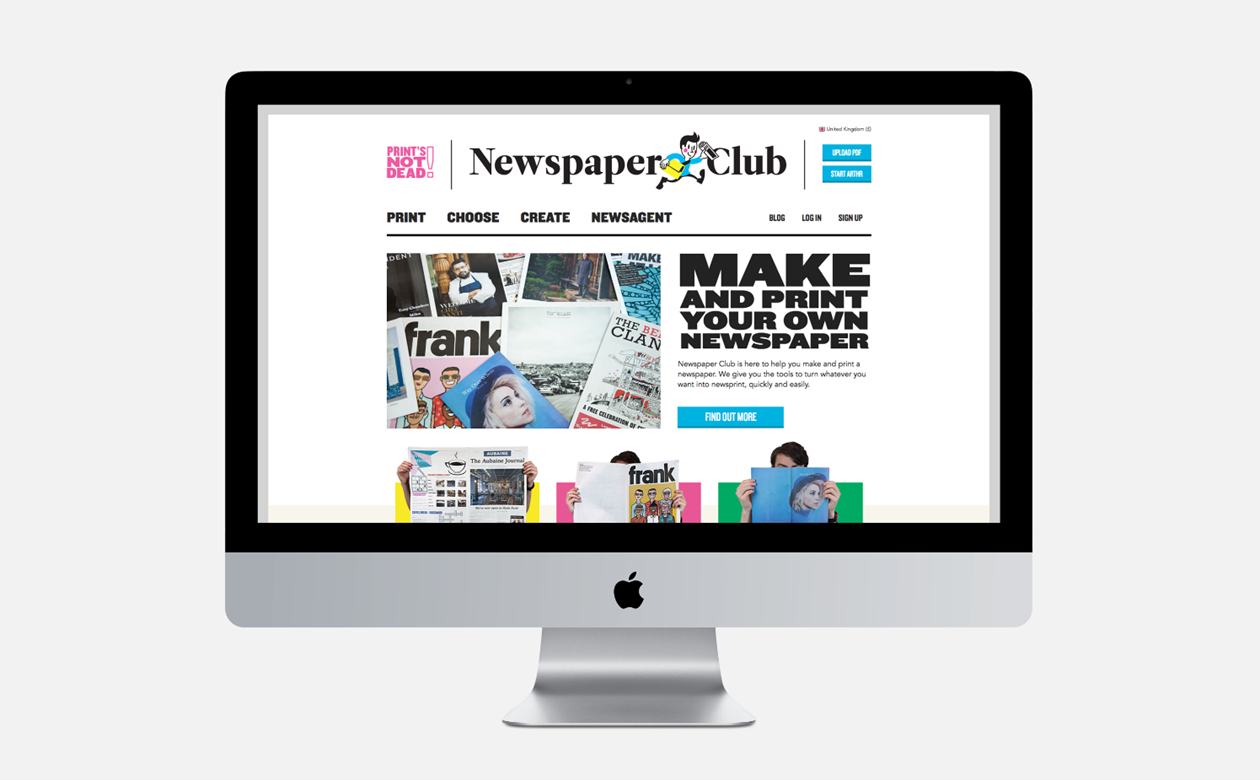
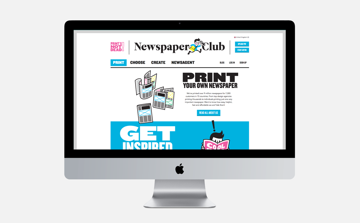
Newspaper Club has printed more than 10 million publications for everyone from students to photographers to banks to restaurants. They needed a website to meet the needs of a growing, increasingly diverse client base. Redesigned around ARTHR, their online production tool.
The challenge
The old site offered all the relative content needed to start printing with The Newspaper Club. However the architecture, navigation and overall user experience meant key information was hard to find and over complex navigation left the user disoriented. With no clear defined user journeys and each page over crowded with links, the user was being diverted away from the content they required.
I was challenged with improving the user journeys and encouraging users to start production of their newspaper. I aimed to do this by educating the users on the products, inspiring them by showing what’s possible and by making it easier to start the design process.
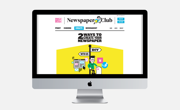
The website needed to allow customers to reach ARTHR - guiding users through a multiple choice-based production process in the minimum of clicks with improved information architecture and navigation, streamlined decision-making and clear calls to action.
My role
As Lead Digital Designer on this project I was tasked with the end-to-end design process. Starting with user research and competitor analysis through to full UX and UI. Including running card-sorting workshops to inform the creation of sitemaps, wireframes and user personas that were the basis of our re-design. I also developed the UI, designing full page visuals breaking down functionality into components in a design spec handover for front-end developers.
UX
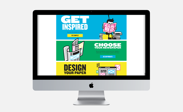
After the card-sorting workshops we took pictures and collated our findings using this to create a site map that works harder to educate and inspire new users. We wanted the users to understand what The Newspaper Club is about and to see for themselves exactly what they are capable of producing.
The new structure created a flow that encouraged and helped the user in the design process. By helping the user understand The Newspaper Club we could be more confident that they understood the process, allowing them to move onto choosing a paper format and starting the design process with confidence.
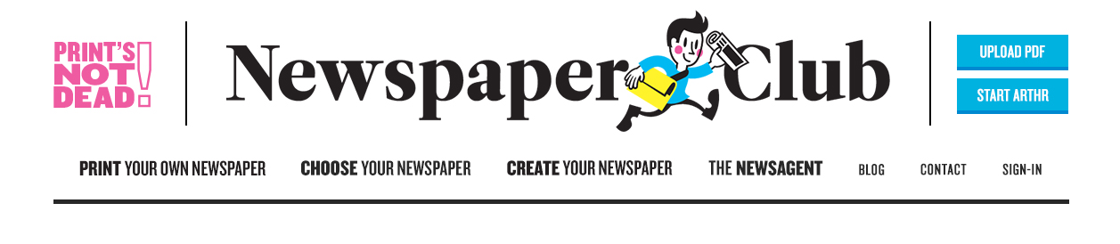
By organising and grouping information around this concept we were able to not only reduce the navigation options in the main header, making it easier for users to find what there looking for but also allowed the content of the site to flow in a more organised way making it easier to understand.
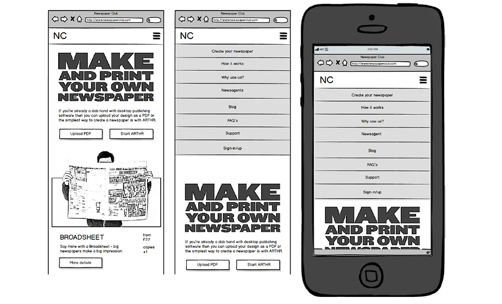
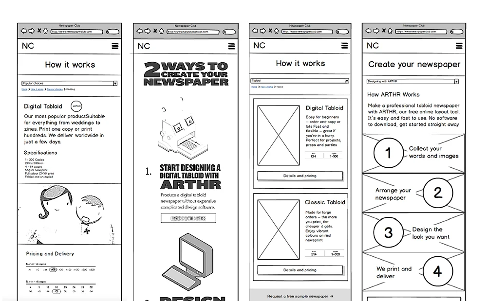
I reduced the main navigation to 4 entry points, clearly defining each section so users can find the content they need more easily and with sub navigation at the top users can easily jump to other useful sections such as Support or FAQ's.
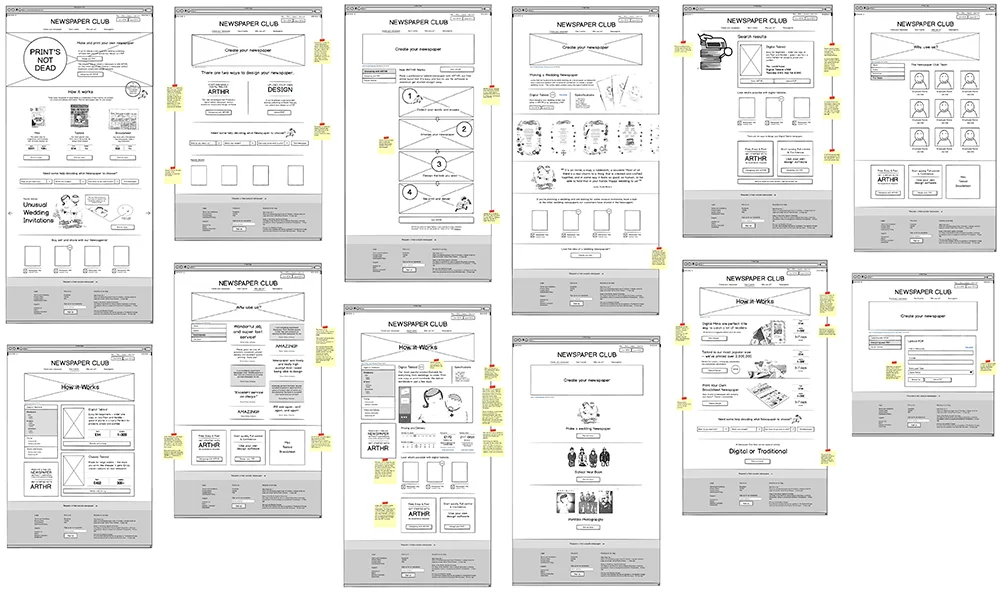
The wireframes were created in Balsamiq and exported into Invison where we made a clickable prototype for the client to review and to carry out customer testing.
Wireframes
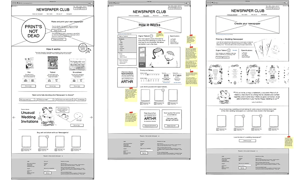
Guide the user with a predicitive solution.
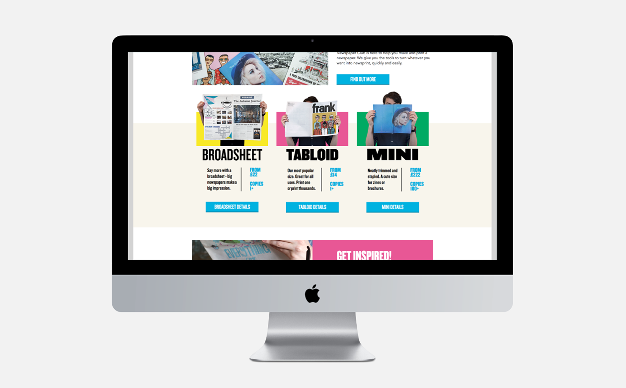
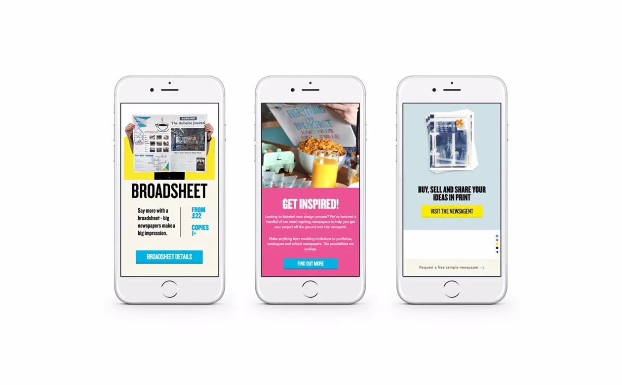
When testing the wireframes the biggest obstacle to customers using the service was not understanding what paper choice was best for them. This uncertainty meant customers were likely to abandon their order. So we came up with a solution to help them decide the best option.
Most users probably come to the newspaper with 3 main constraints they have to work to; Time, Budget and Quantity. In offering either one of these pieces of information as a start point, we can begin to predicit a solution that suits them, the idea is to reduce the amount of decision making required when choosing their newspaper and proceeding to print. By forcing users into choosing one of the three criteria, Newspaper Club can predict and offer a solution that suits. These predictions could be amended along the way, but the steps would allow us to surface information related to each decision, making it a far more enjoyable experience. It's about being a guide.
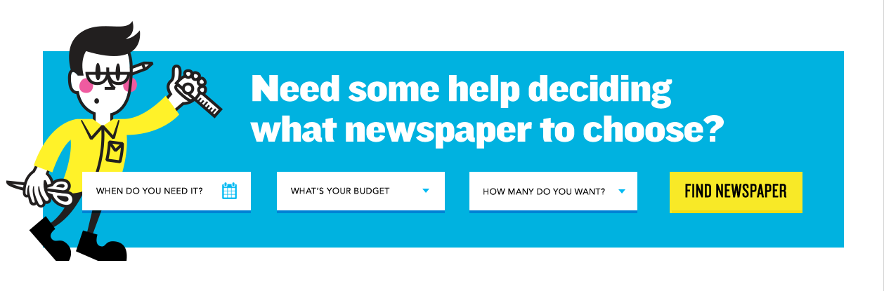
With the predictive option we can streamline the user journey. Cuttting out the need to jump between pages and information. Limiting the number of links and buttons in front of users should simplify their decision-making process.
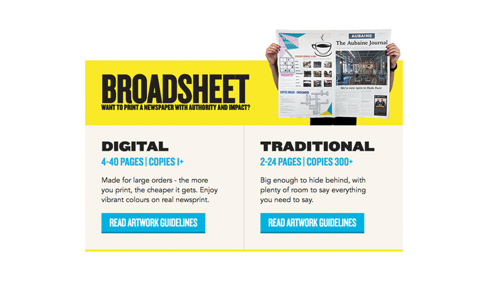
Were not eliminating products. Instead, were showing how streamlining offerings could potentially encourage users to continue into production. Making it easier for new users to create there newspaper. Similar to a newspaper masthead the homepage heading will give the site its identity. This will give users and instant feel of what the newspaper club are all about and will also invoke the feel, and familiarity of a newspaper. Although we will not over do it as we want to keep it modern and only hint at the history and traditions of newspaper.
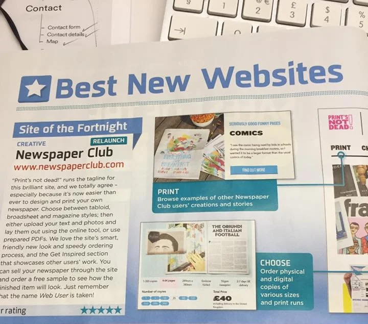
“We love the site’s smart, friendly new look and speedy ordering process”