Helping Sky reach new heights of customer care.
COMPANY
Sky
Contract
4 Years
POSITION
Senior Designer
Overview
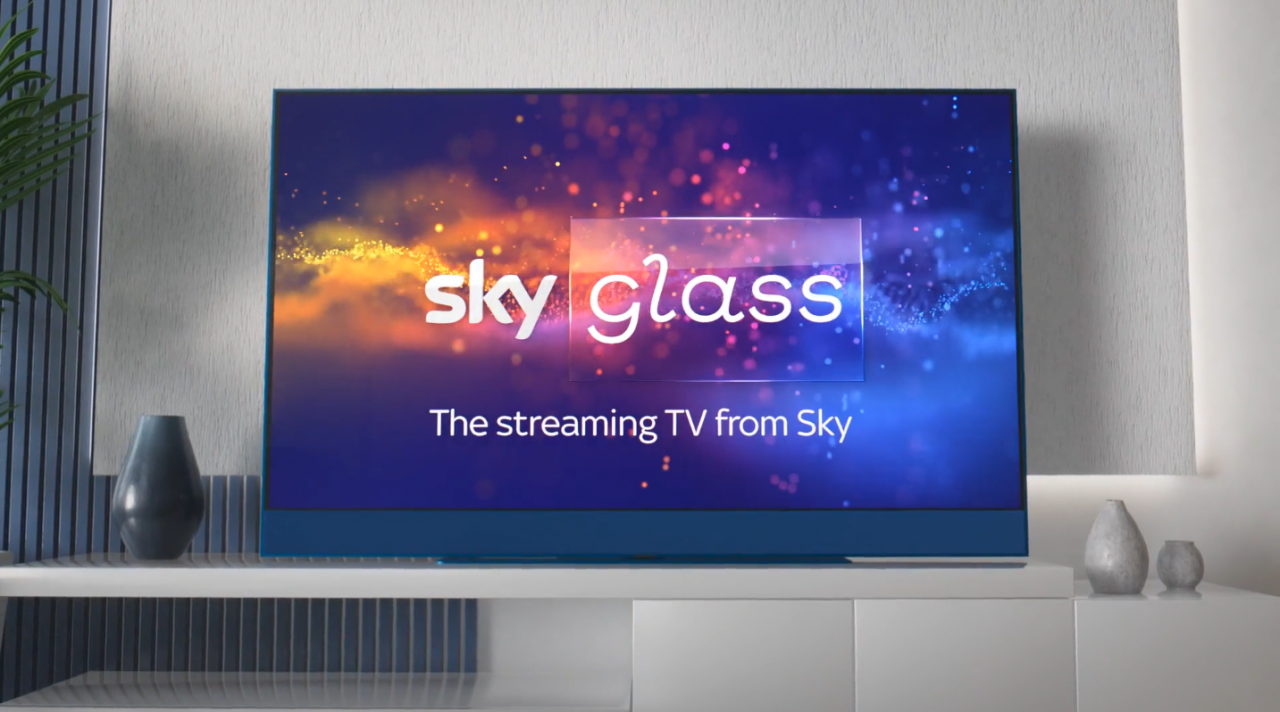
With the launch of Sky Glass in October 2021. There was a requirement to re-design it’s agents platforms to improve functionality. The aim of the re-design would allow agents to provide better customer service and care.
As part of the re-design Sky plans on leveraging data to build a complete & consistent care platform. It is an omni-channel platform so the same back end services drive the assurance journeys for call centres, retail agents and customers online.
The challenge
Sky tasked our design team to design a new platform that will help customers & agents ensure Sky products & services are working to the precise high standards they promise. Some of the key deliverables were:
Real-time monitoring, getting to issues before our customers.
Decisions and actions based on data and insight.
No product silos to support our increasingly inter-dependant offering.
Same functionality in every channel, with a consistent experience for our customers & people.
Maintain and improve current functionality of legacy systems.
Sky prides themselves on quality customer care and with the launch of their new Sky Glass technology it was important that agents were able to help customers calling in with issues. Issues not only related to Sky Glass but to legacy products as well. By the end of three years we launched a Care Platform that met the goals mentioned above. It comprised of three main parts: Care Hub, Diagnostics and Test Results.
Care Hub
Care hub is where we give agents a breakdown of where issues may lie within the customer’s home. The page is split into two overall sections:
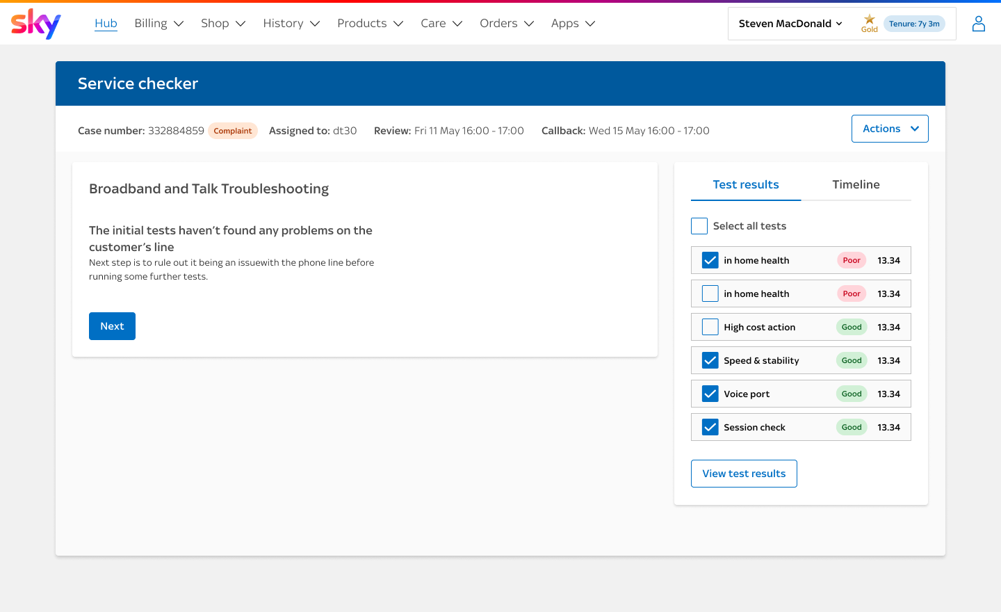
Service Checker
Left hand side is a visual overview of the TV & Broadband products within the customer’s home.
Product breakdown
The Right hand side is a further breakdown per product for TV, Broadband & Mobile, with the ability to run diagnostics for all.
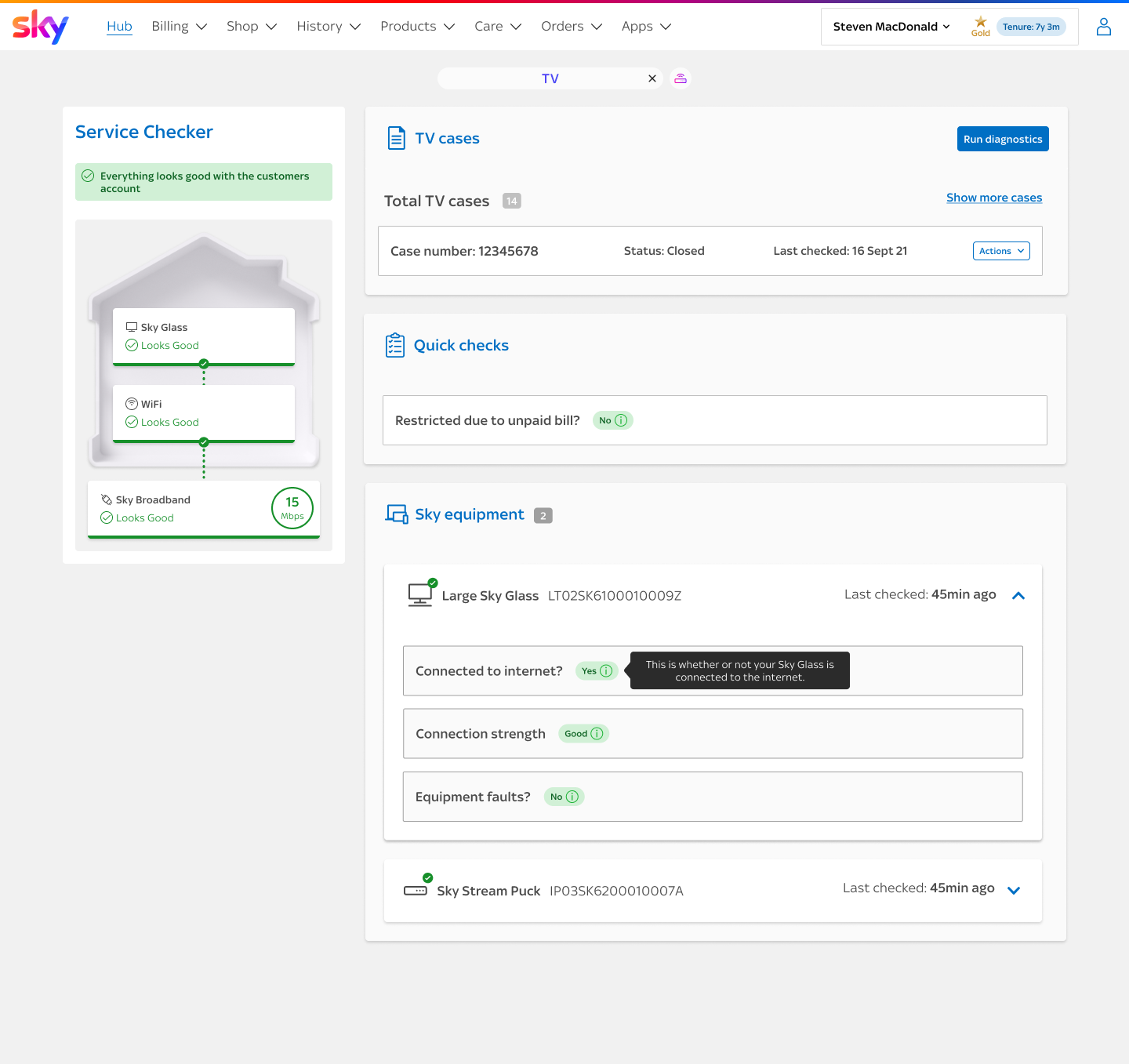
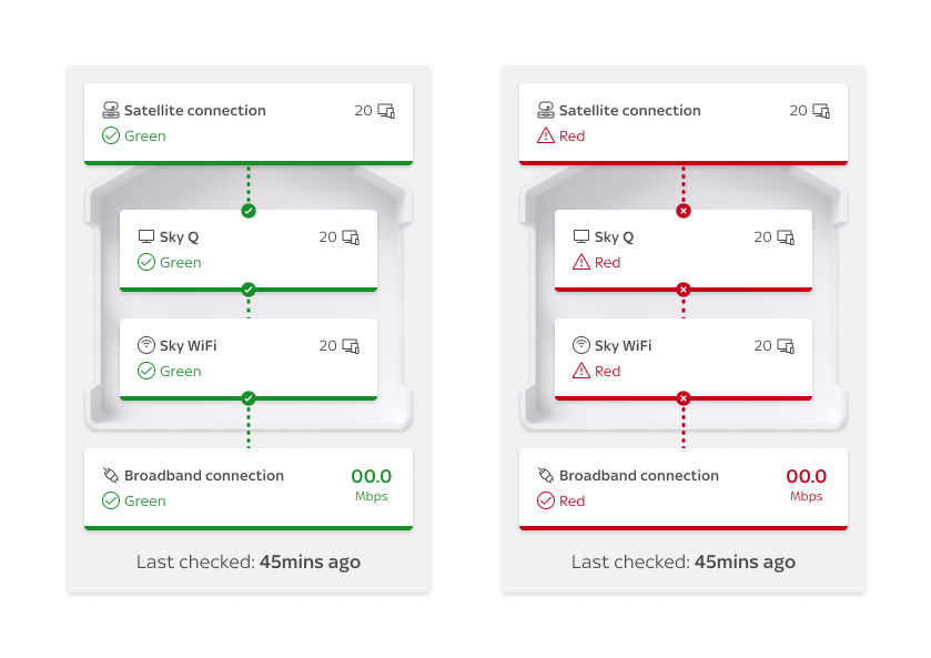
The house is a shared concept across direct and digital to aid conversations between agents and customers. They both see the same graphic so a conversation can easily be had around where the issue might lie.
If no issues are detected the house shows as green but if any of the data we use to populate the house shows an issue then that area of the house will turn red. If that issue has a knock on impact to another part of the house then it will show as amber
The message at the top is a rolled up summary of what is happening in the house, this aligns with the messages we show on the customers home page.
An example the Figma prototype illustrates how the interactive components within the house animate.
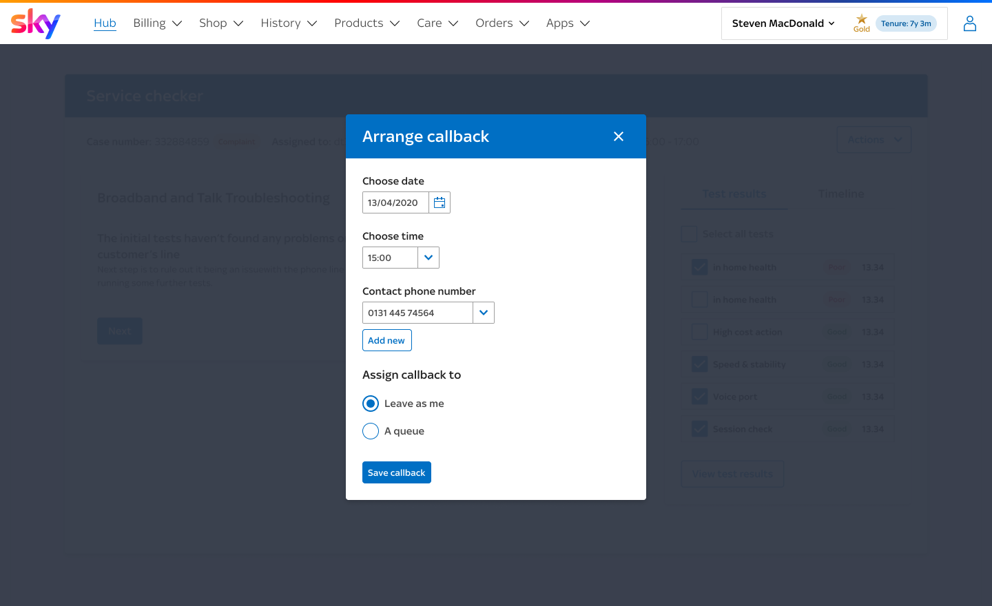
Diagnostics
Regardless if an agent finds an issue on the care hub or not with the upfront telemetry and service checks, both agents and customers have the ability to run through steps to help diagnose and troubleshoot issues.
Some of these steps are based on system checks that are performed. If these checks uncover an issue then we show steps that will hopefully help fix it and then we can run the check again to see if the issue is solved. We do our best to guide the agent down the most useful path, within the least number of steps
“This seems very straightforward and easy, I love it”
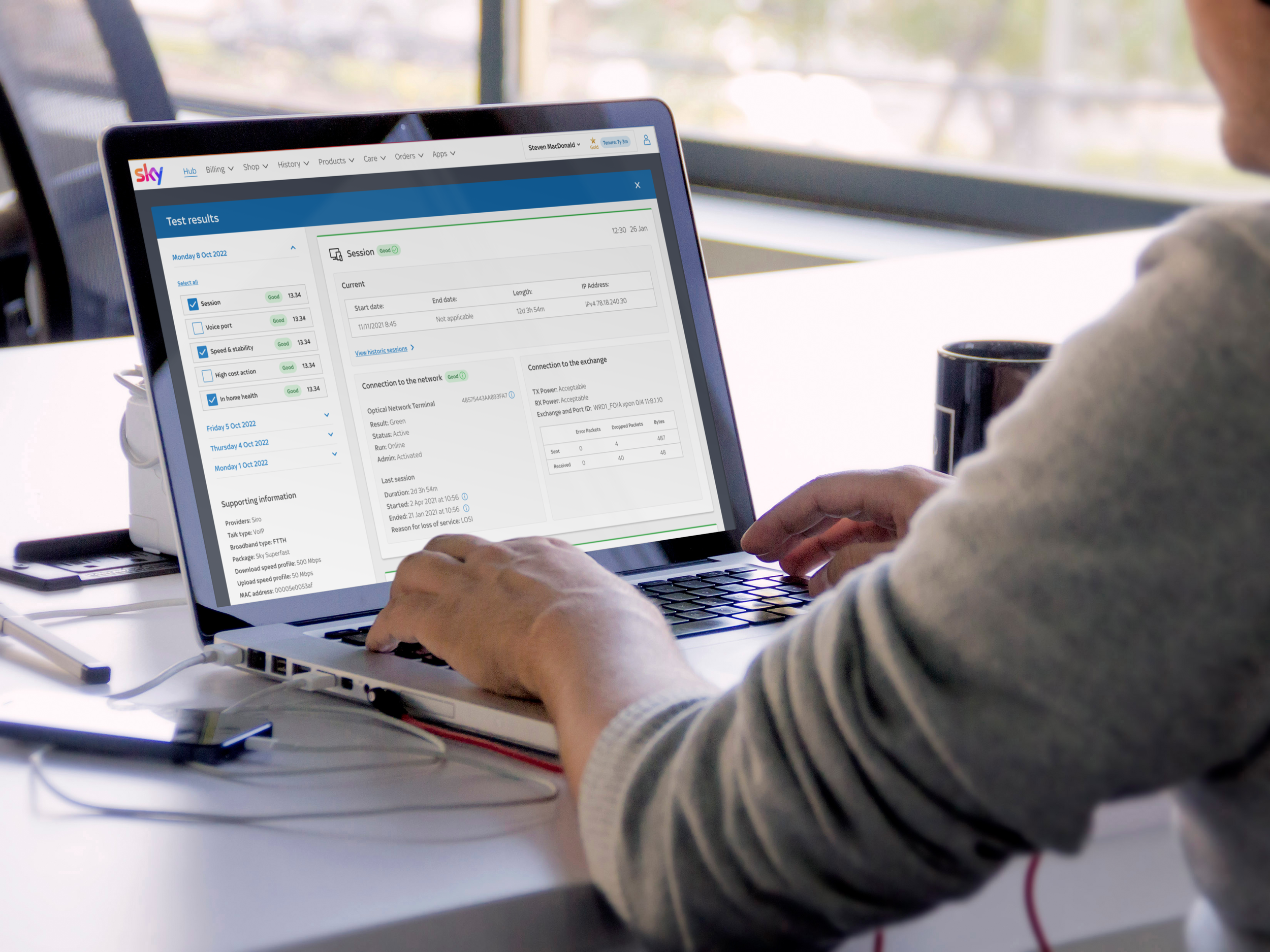
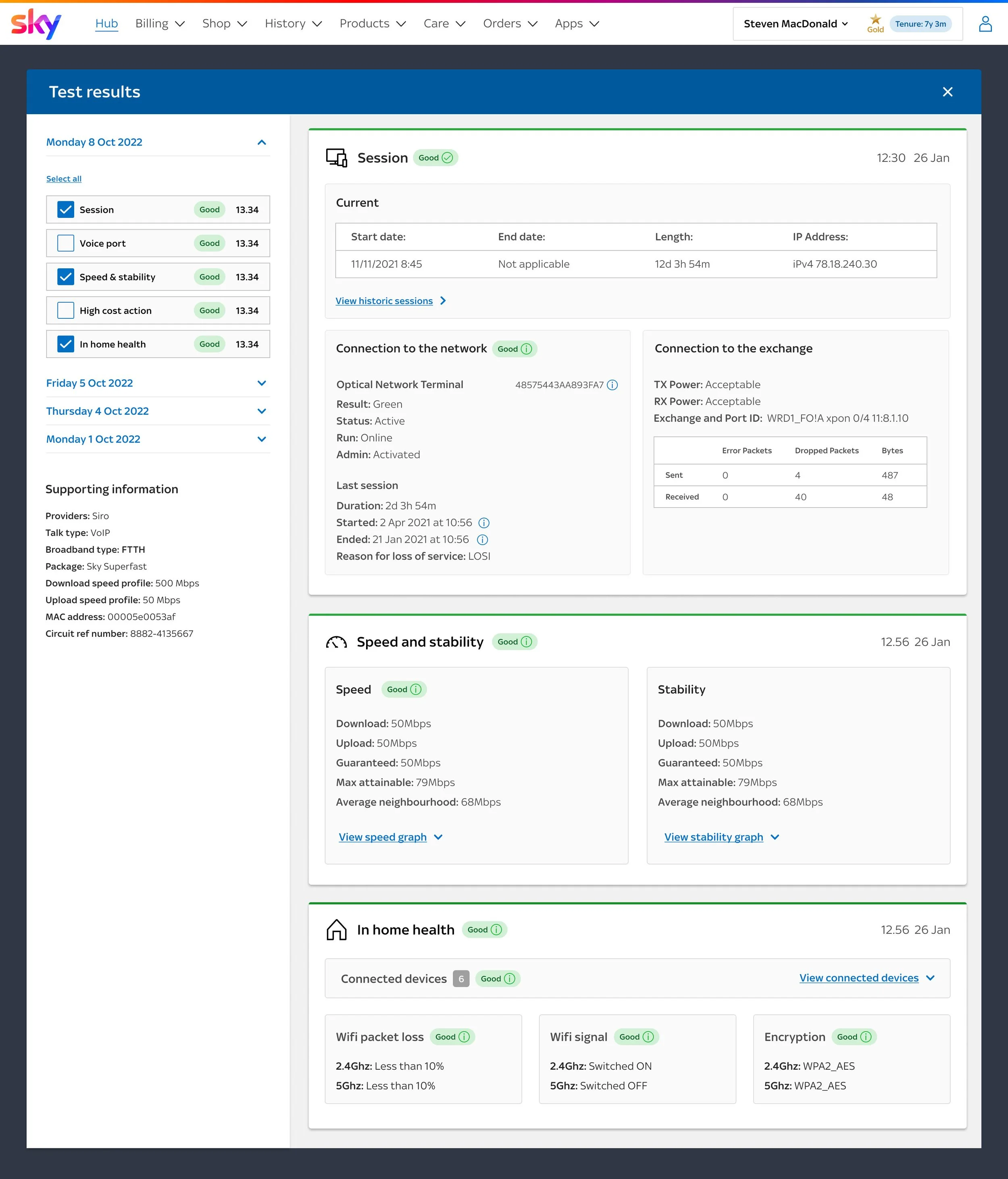
Test dashboard
Based on user testing, focus groups and conversations with UK & ROI agents there were four key areas they wanted to focus on when reviewing test results.
Single place to view all results
Show minimal info on open
Ability to compare results
Explanation of RAG results
““The new design is so much better than what we had, test results used to feel hidden whereas this is so much easier to access and understand””
My role
As the only UI Designer aligned to Care, I worked closely with UX and development teams to design the Care Hub, Diagnostics and Test Results. As well as building the UI we developed a Design System called Spectrum alongside this creating components that created consistency across the platform. We also developed a UI Toolkit that contained page templates, layouts and components.
We delivered the UI in features that were built by different Development teams. For this reason handover was key to successful implementation of the UI.
I also created fully clickable prototypes in Figma for user testing and facilitated workshops in FigJam.
“Ryan was brought in to help expedite the deliverly of our design system and he didn't disappoint - quickly getting up to speed with our internal design language and producing high quality work right out of the gate.
He was able to take our UX requirements and translate them into high-fidelity, resuable Figma components, complete with documentation. Ryan also managed the developer handoff, ensuring the integrity of the designs made it into production.
On top of being a skilled designer, Ryan was extremely personable and integrated seamlessly into the team, I would gladly work with him again on future projects.”