Transforming RBS’ Mortgage platform.
COMPANY
Royal Bank Of Scotland
Contract
6 Months
POSITION
Senior UX Designer
Overview
Getting a mortgage can seem tricky. There are lots of different factors to consider and different types of mortgages to compare. However, once a mortgage is selected there are still a lot of complex decisions to navigate when managing a mortgage. How could RBS improve their mortgage platform?

The challenge
RBS wanted to re-design their mortgage platform to make it easier for customers to manage their mortgages. This included making regular payments into their mortgage, making overpayments and understanding the impacts of these payments on their mortgage balance over time. At the time this was the biggest investment made by the bank on any of thier digital offerings and it made it a high profile project with a lot of interest in it across the business.
My role
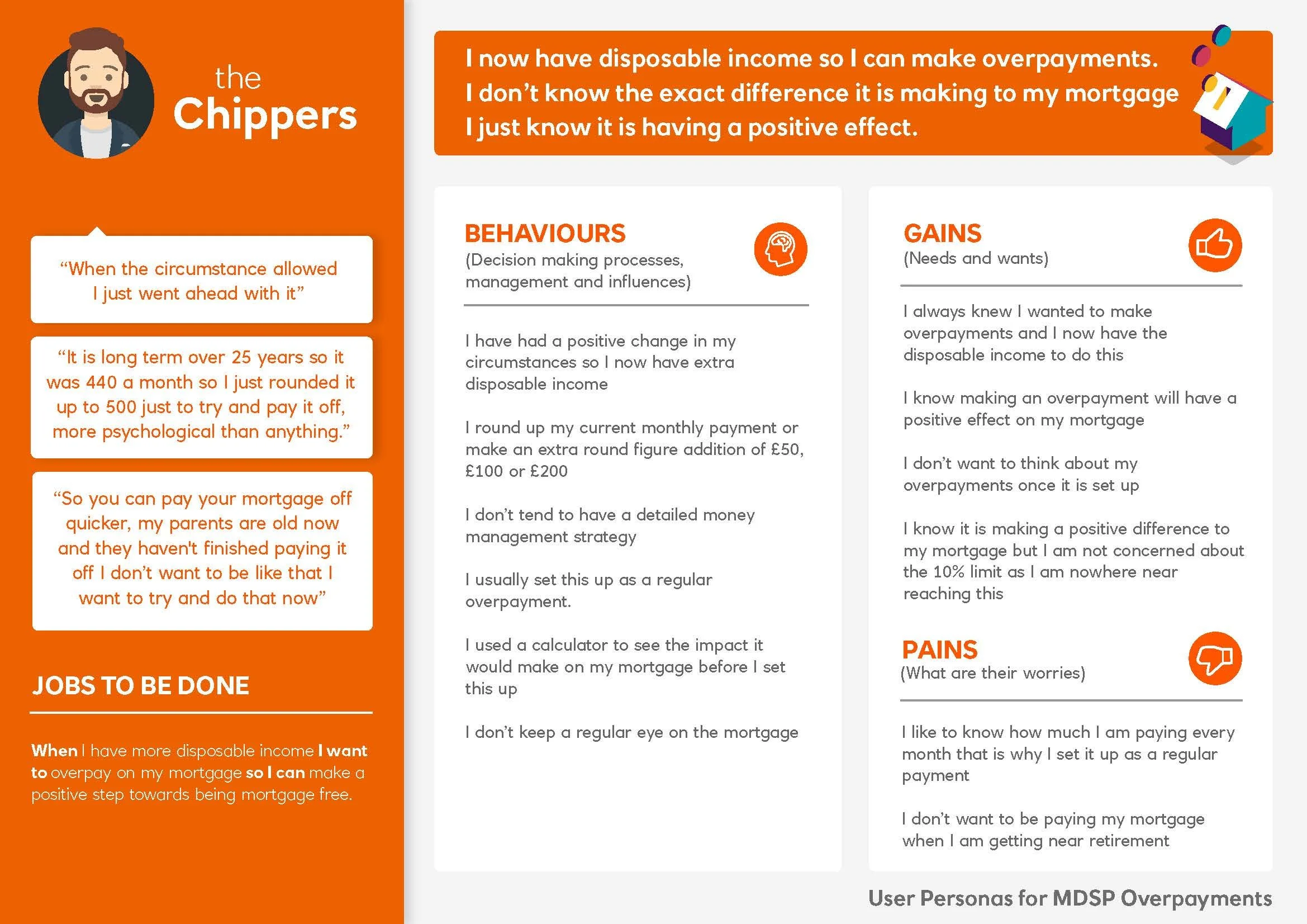
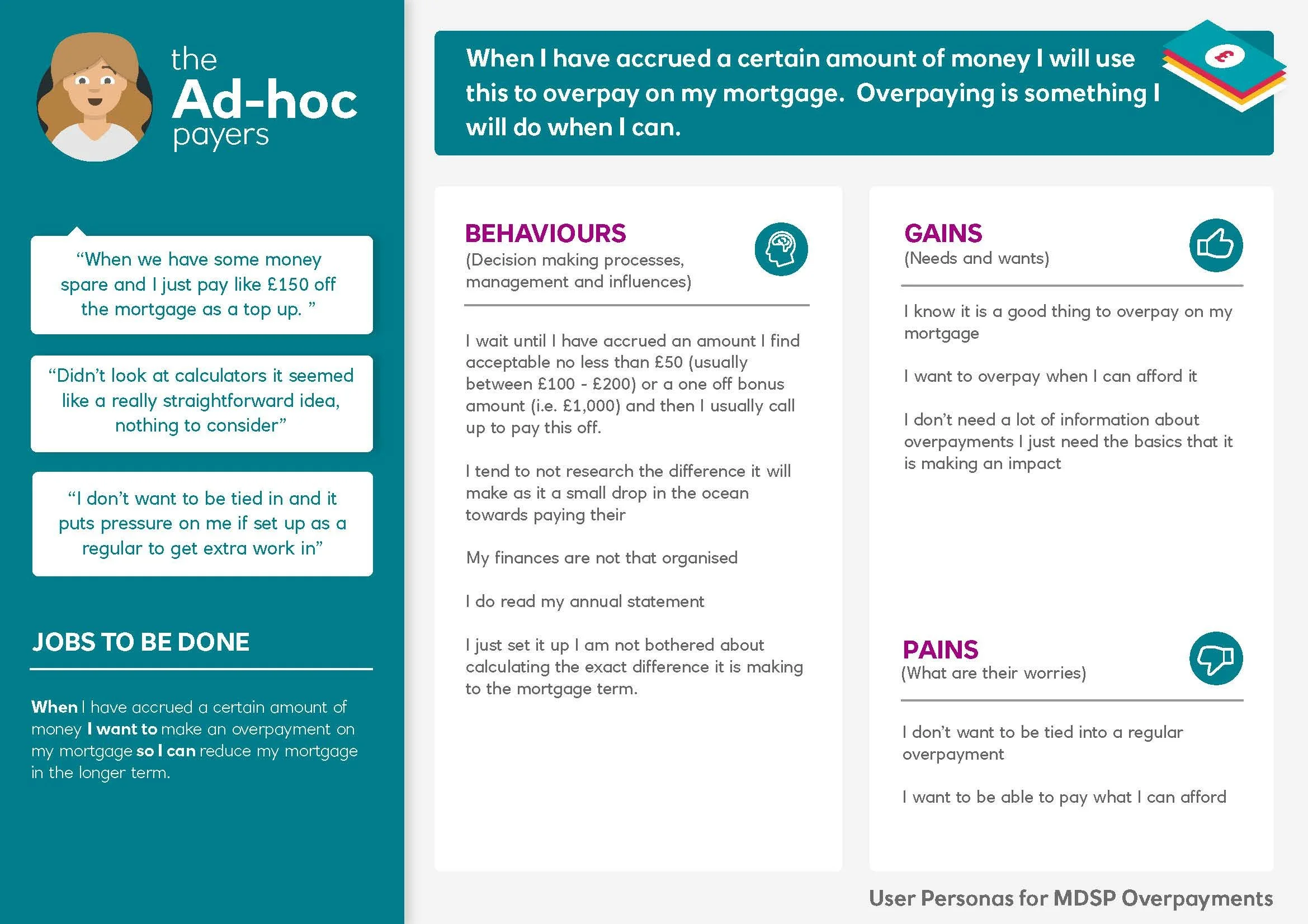
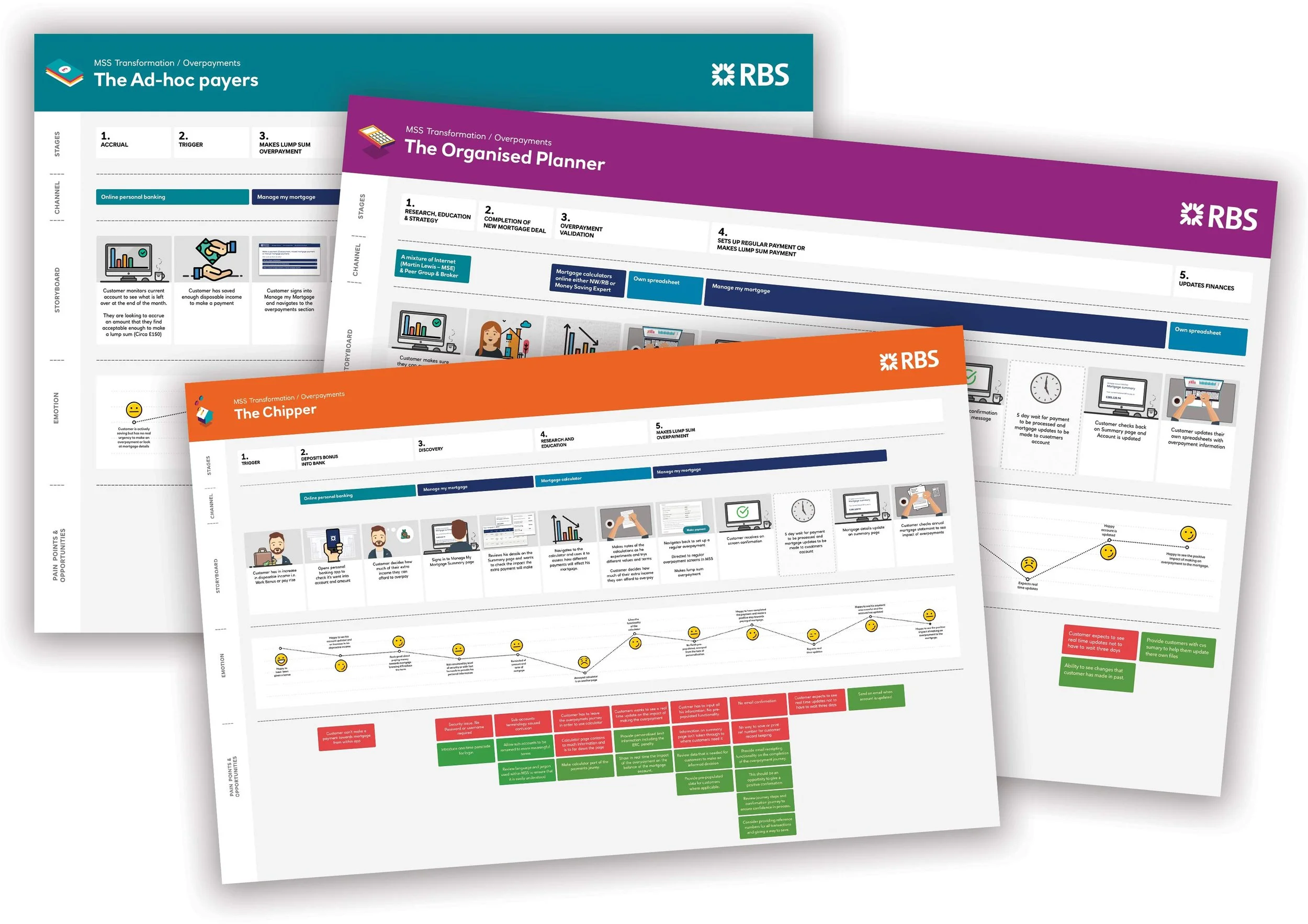
As a Senior UX Designer, I helped facilitate and organise research including customer and staff interviews, and reading industry research. I also carried out testing on the current mortgage platform. Our findings from this allowed me to create User personas and journey Maps which informed the development of wireframes. We then used these to create two prototypes which we tested on site with people who aligned with our user personas. These prototypes were developed and eventually passed to a UI designer and devleopment team.
Research
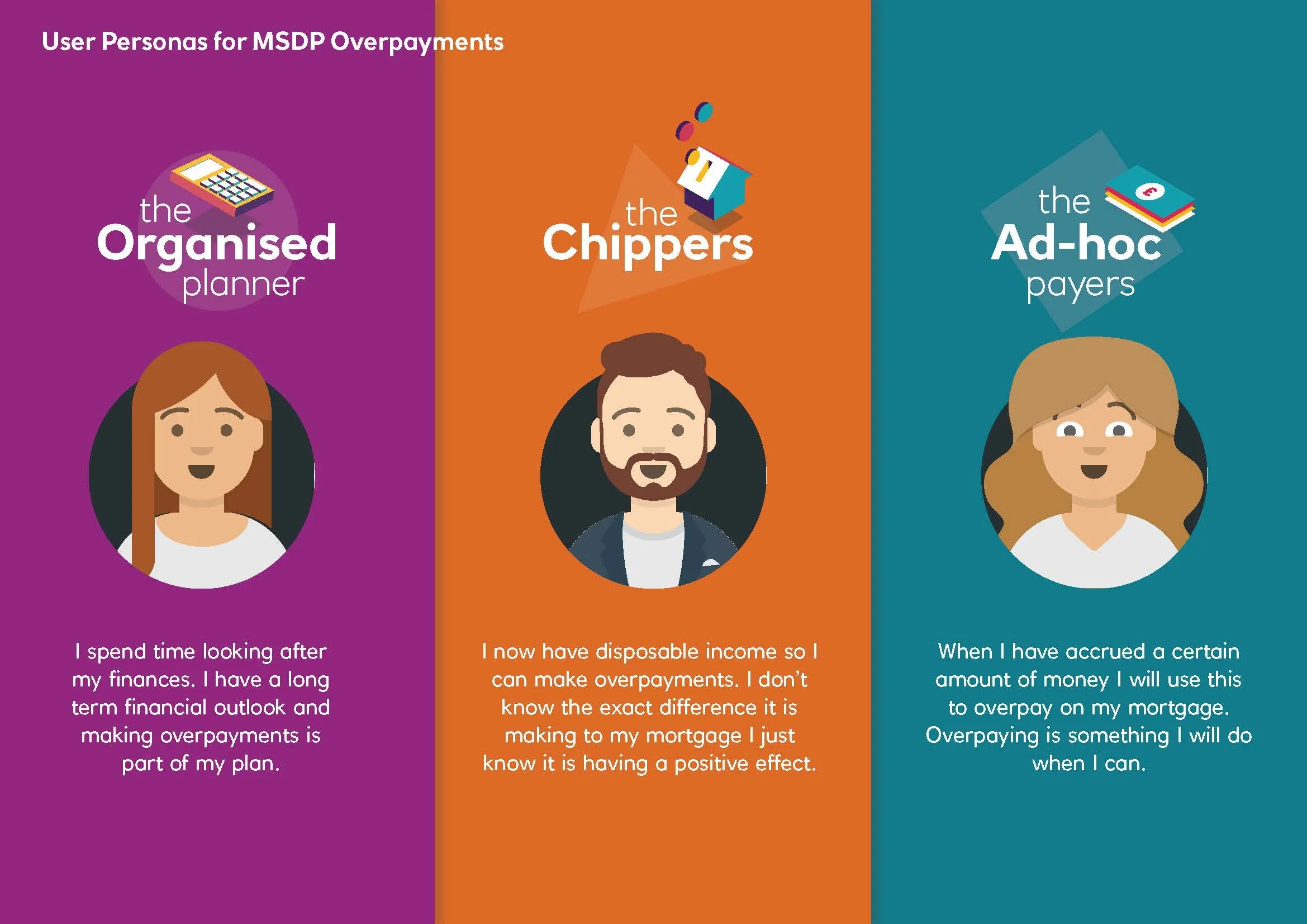
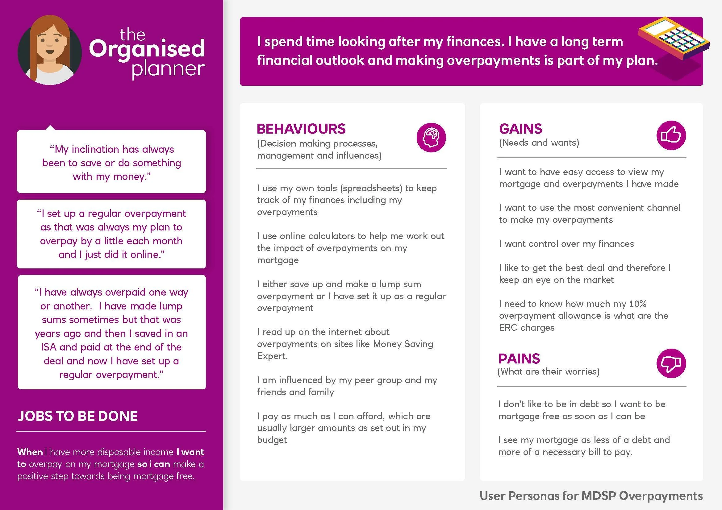
As a Senior UX Designer, I helped facilitate and organise research including customer and staff interviews, and industry research. These then allowed me to create User personas and journey Maps.
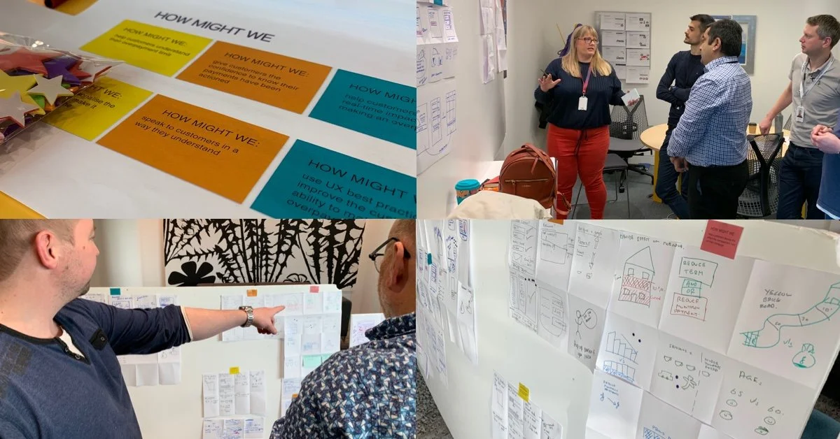
Workshops
Once we had a good idea of the user personas we ran workshops with the wider team. This included Analysts, Developers, and key business stakeholders. This helped us generate ideas and understand some of the intricacies associated with the current platform.
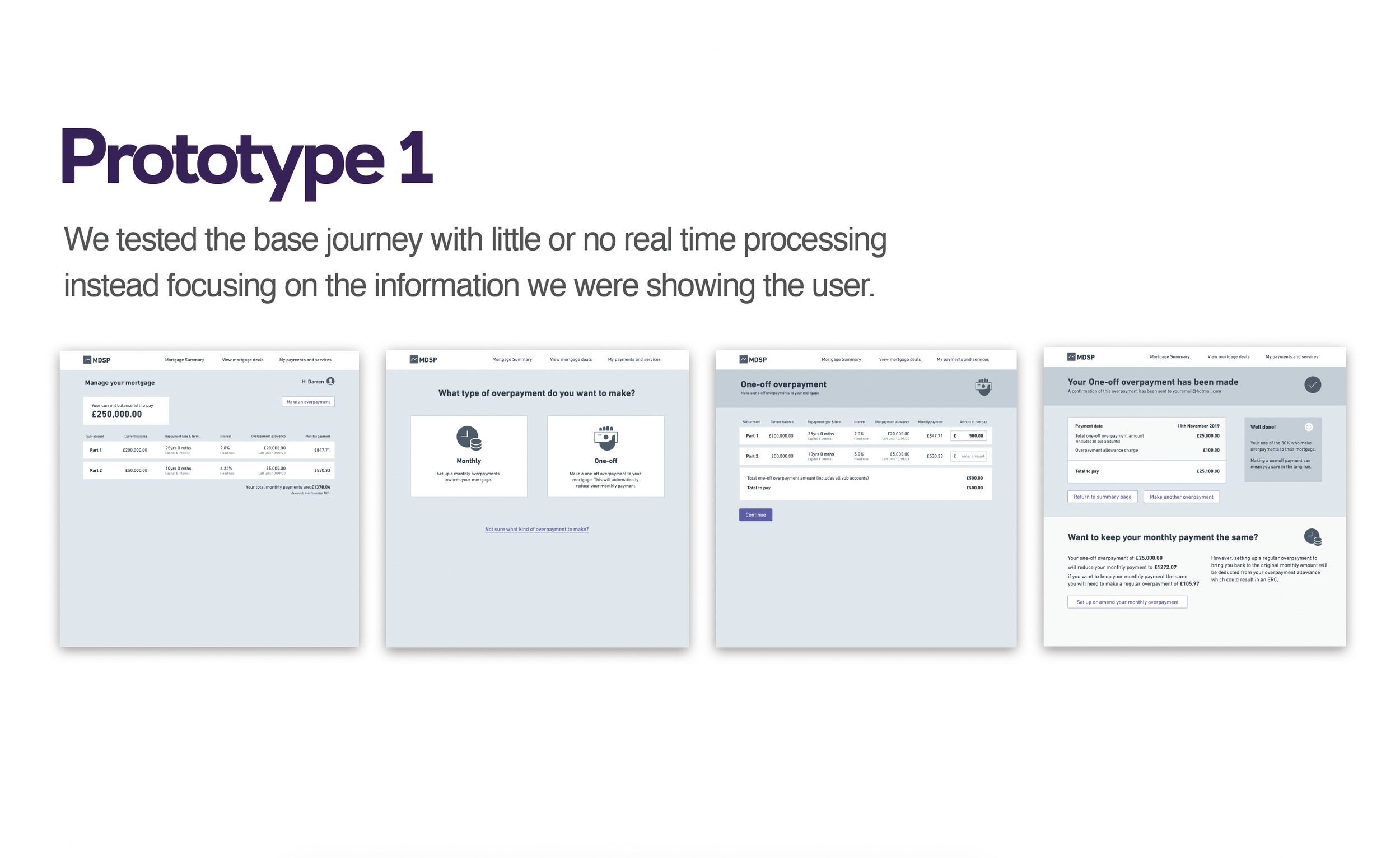
Wireframes & Prototypes
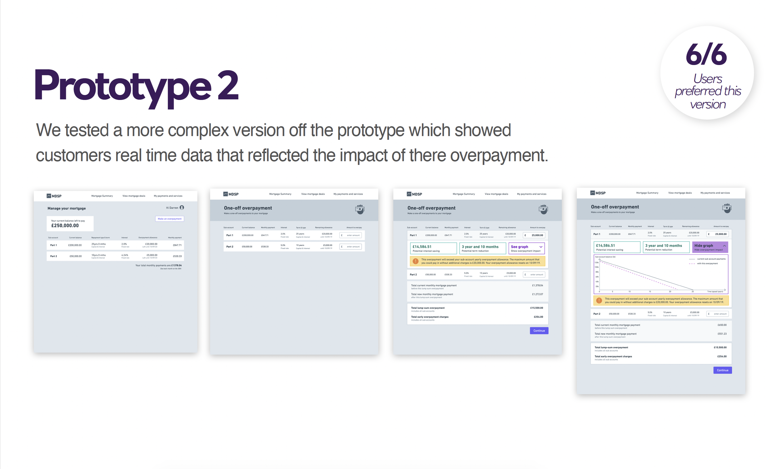
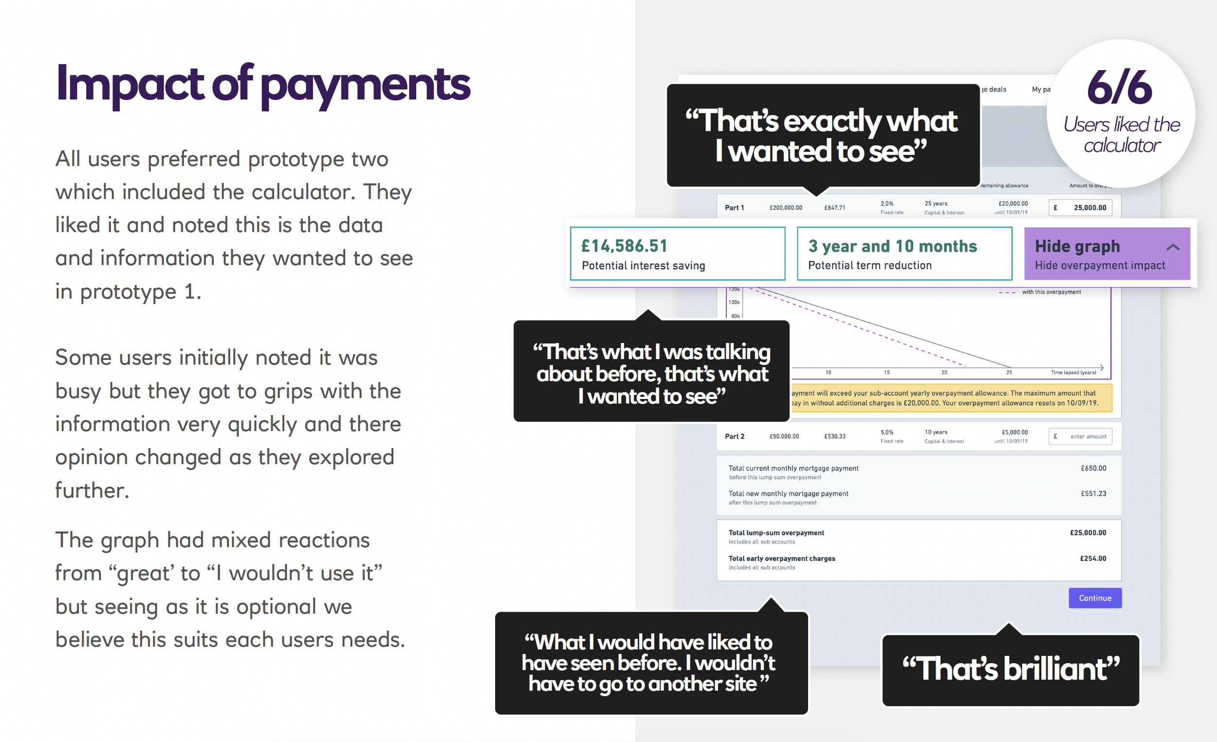
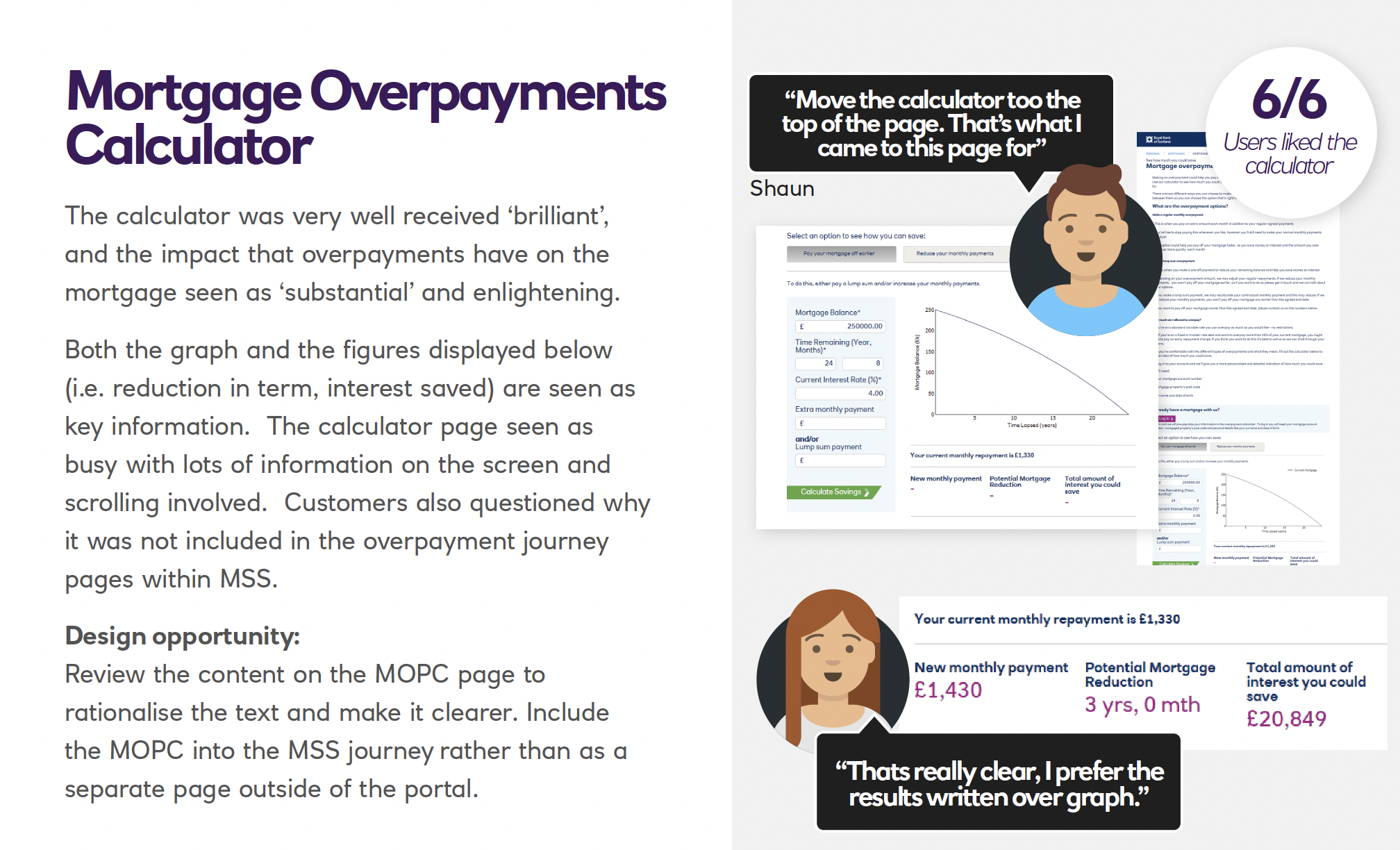
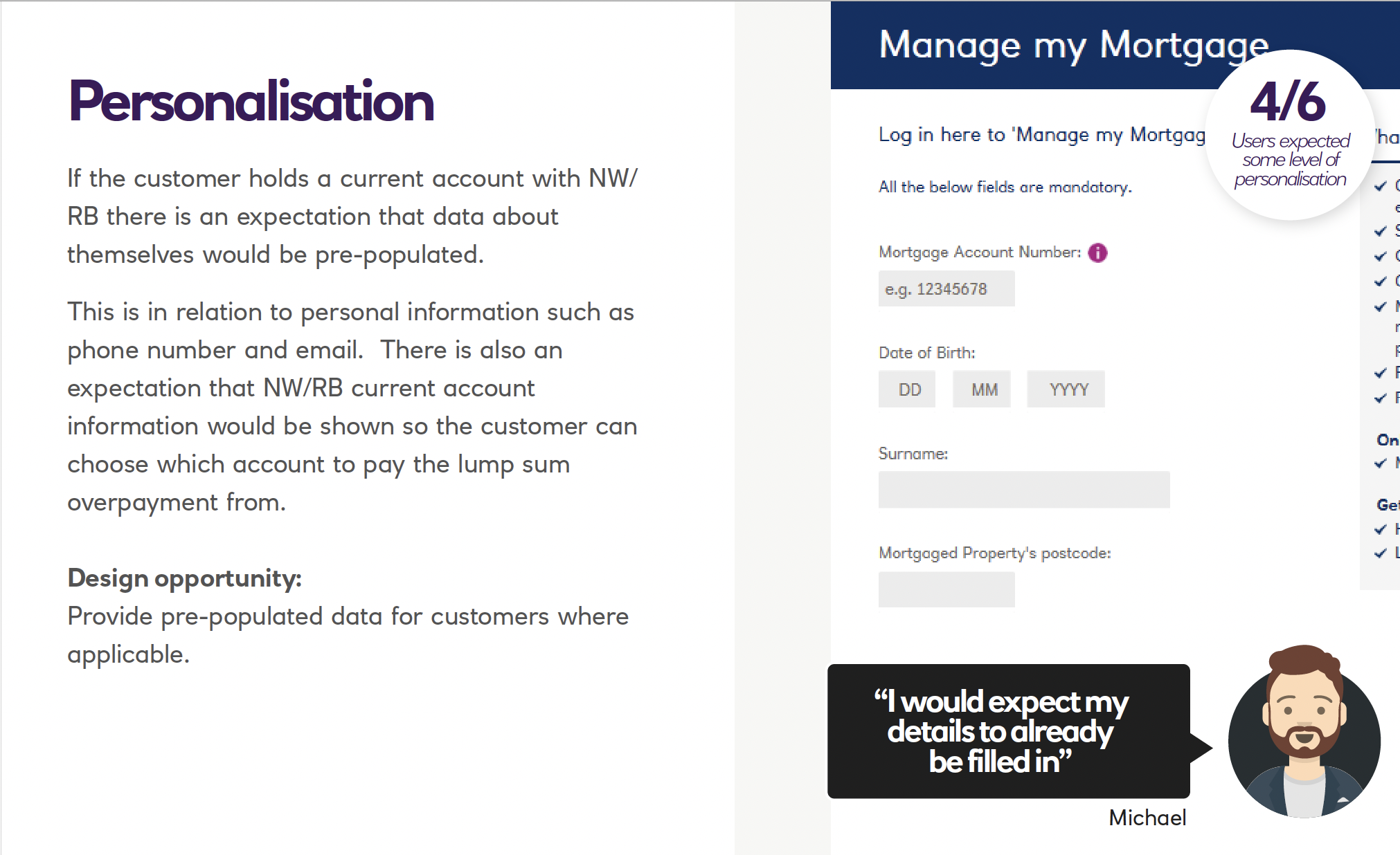
After generating ideas that the full team were involved in creating we developed wireframes and created a clickable prototype for two journeys. This was due to the mixed reaction of the current overpayments calculator which some customers found confusing.
User Testing
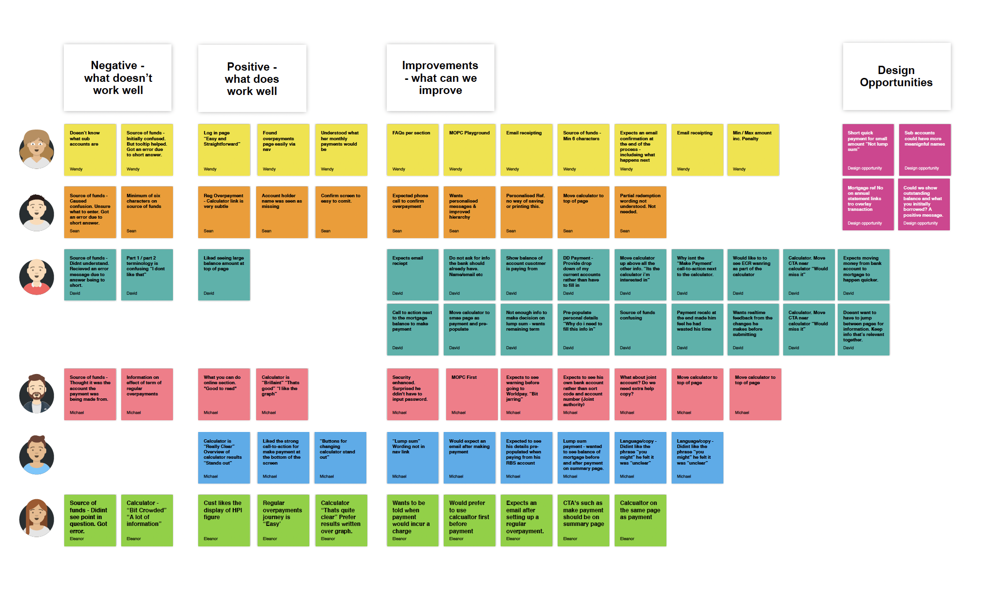
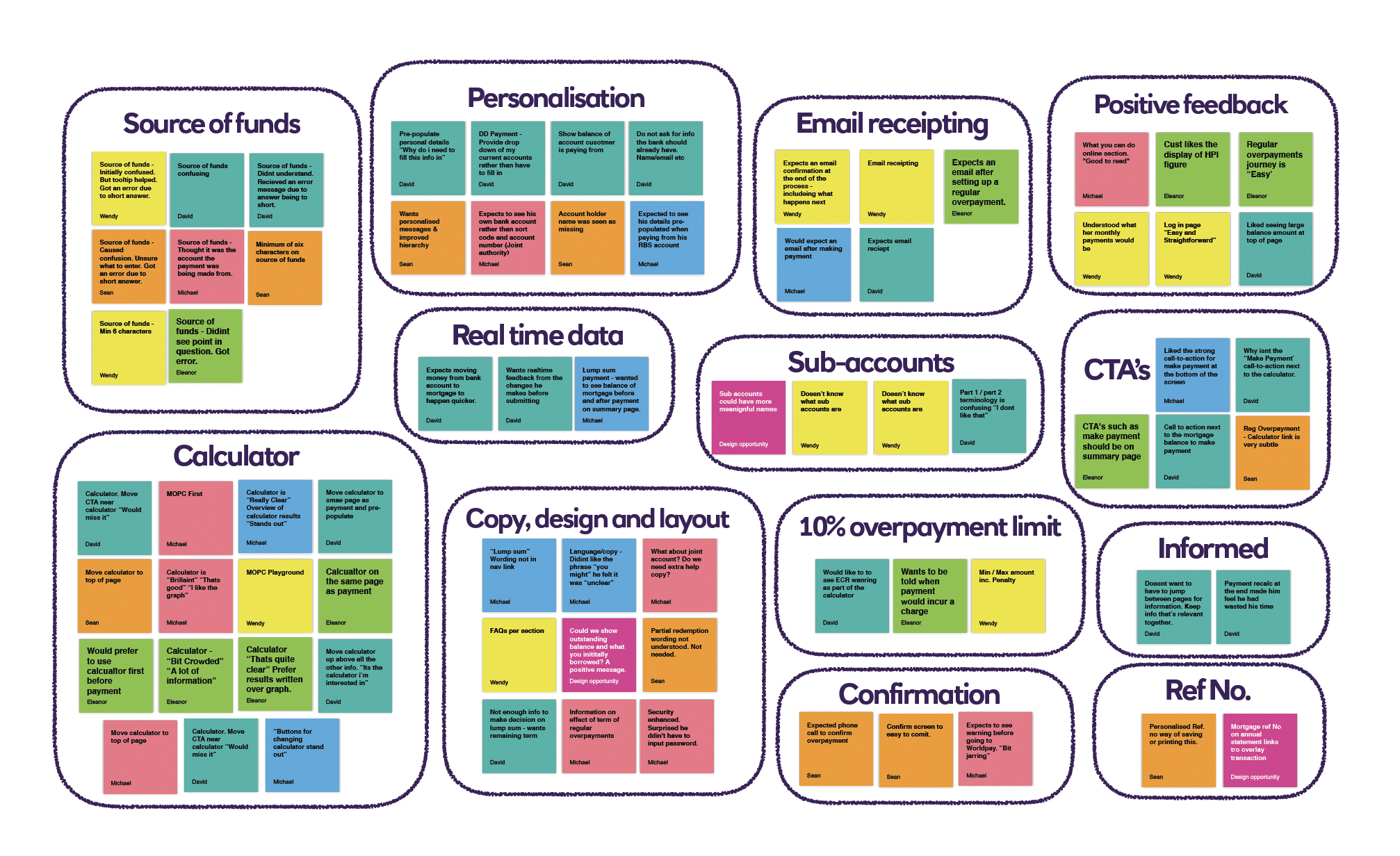
We A/B tested the two designs one with an overpayments calculator and one without. Running the test over two days at RBS offices with people who aligned with our original personas. We invited people across the business to come and watch the testing and also provided a link for people to watch remotely. This allowed everyone to experience the customer feedback first hand. We collected this feedback by asking participants to write any key findings that they heard on a post-its and stick it to the wall. These post-its were then the focal point of a discussion where we collated them into categories to capture key areas for potential improvement.
Stakeholder management
As well as being UX Designer on the project I was also asked a month into the project to take on a Lead role for the project. This involved attending planing meetings and communicating our progress to the leadership team. A lot of the videos and images on this page were created to get business by in and help people understand the importance of the end to end design process and better communicate our findings.
Output
Software